ABOUT – ANIMATION – BRAND DESIGN – CONTENT CREATION –ILLUSTRATION – WEB DESIGN – 3D MODELS
![]() E: contact@leveenapeter.co.uk
E: contact@leveenapeter.co.uk
![]()

Colour palette
Approach
![]()
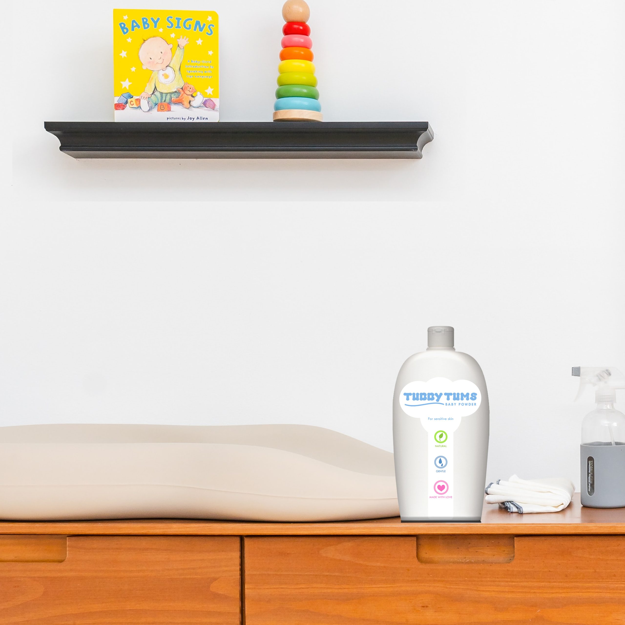
Use of soft, rounded typography for the logo. This decision was made with the awareness that baby/children’s products do not typically use fonts with harsh, sharp edges. I created chunky, friendly lettering that can be likened to the chunkiness of babies and associated with the softness of children’s skincare products.
It was important to use a pastel-based colour palette that clearly reflected that this is not only a gentle product for babies, but also that this is a kind product designed for sensitive skin.
The design for this brand also included the creation of icons that emphasised key selling points of the product, such as the fact that it is made from natural ingredients. ![]()
Key features
• Font creation
• Logo design
• Packaging design
• Iconography