ABOUT – ANIMATION – BRAND DESIGN – CONTENT CREATION –ILLUSTRATION – WEB DESIGN – 3D MODELS
![]() E: contact@leveenapeter.co.uk
E: contact@leveenapeter.co.uk


Approach
![]()
Brand design concepts for a film streaming service that specialises in romance movies. It is aimed at an audience of mainly females aged 25-65.
![]()
Logo: It was important to communicate softness and familiarity in the logo, as the core subject around this brand is gentle and emotive. I used two contrasting types of ‘feminine’ fonts – 1) a heavy serif font for an element of classiness and 2) I created custom lettering in a dainty line style. Keeping to the theme of love and romance, I used a warm shade of as the key accent colour, whilst keeping the text black to prevent the logo from appearing too child-like. For iconography, I implemented a traditional symbol of love and romance, the heart, but used it in a less obvious way as a cut out to make the logo stand out more as a whole.
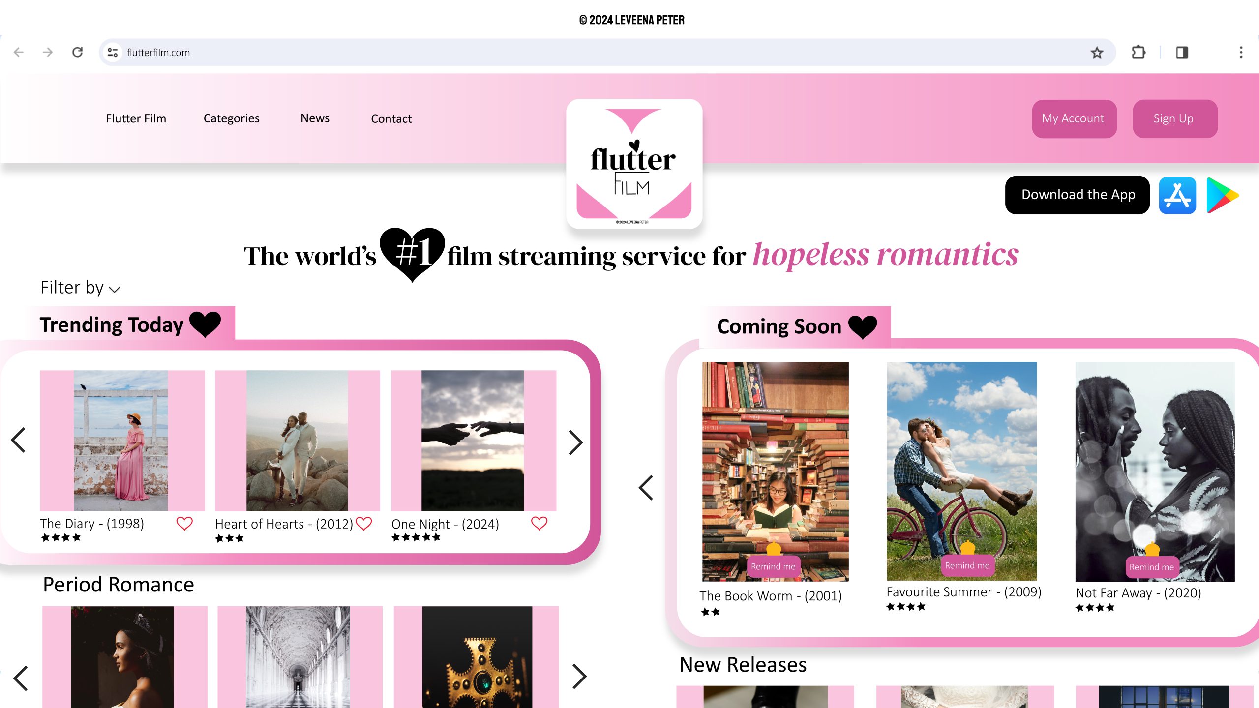
Home page: Using the main warm pink accent colour from the logo as the base, I chose a palette of varying shades of pink, to create sections. The layout of the design was heavily influenced by existing film streaming platforms that utilise clear content suggestions and carousel categories, making it easy for users to find something suitable to watch.
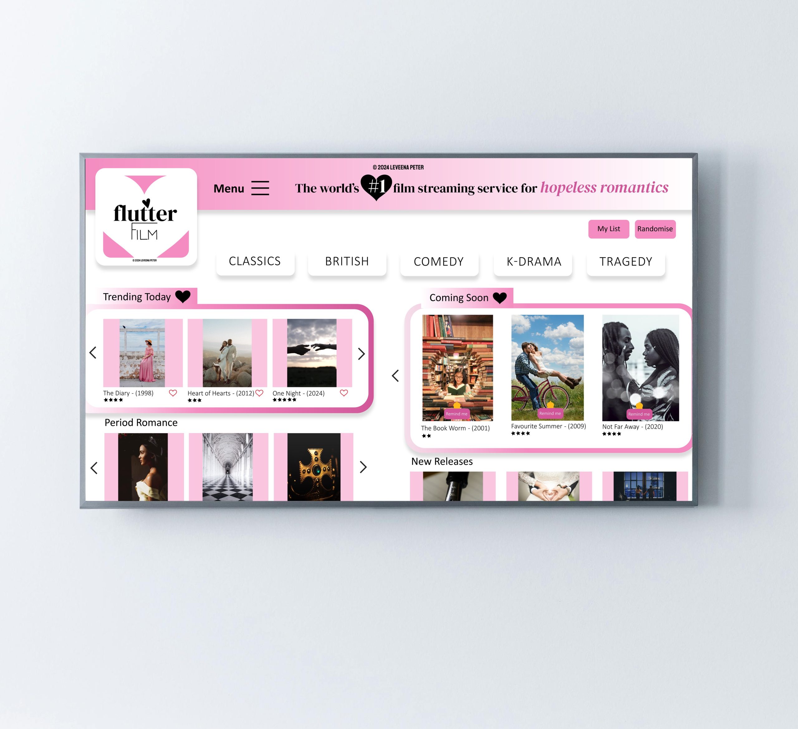
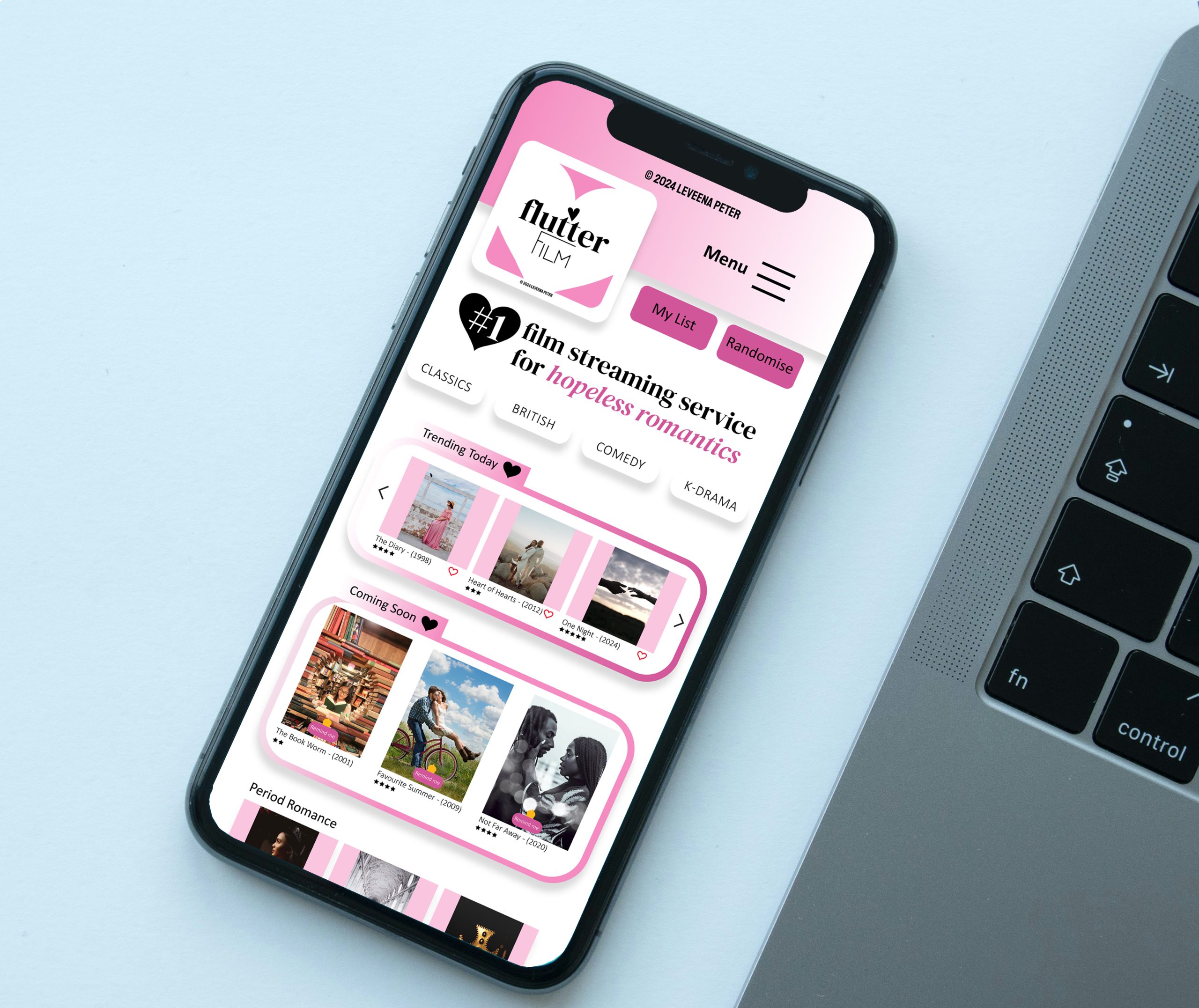
UI design: The design concept for the website home page was essentially recreated for the app interface. I made small tweaks based on different functionality, such as replacing the horizontal menu bar with a responsive burger menu icon and adding genre buttons to make selecting a film via TV and mobile easier.
Key features
• Business name
• Logo design
• Home page design
• UI design


